Pearle's
Pantry - Brand Development
A food and culture retreat brand rooted in the Caribbean, built to sit well outside the usual tourism marketing playbook.

Brand voice, cultural positioning, visual identity direction
Pearle's Pantry runs food and culture retreats across St Kitts and Nevis, built around the idea that sharing a meal is one of the more reliable ways human beings actually connect. The brand carries a genuine founding story, and its audience are travellers who have grown tired of surface-level experiences and want something that leaves a mark beyond a highlight reel.
The work was to give that story the infrastructure it needed: a voice that could hold the brand's cultural weight without tipping into the reverential, a positioning that placed it in deliberate contrast to conventional destination marketing, and a visual direction grounded in the palette and warmth of the islands themselves.
01 / Brand Voice
Reassuring, curious, and honest about imperfection
Food and retreat brands tend to overclaim. The copy reaches for words like "transformative" and "immersive" and "authentic," which strip the very thing they're trying to describe of its credibility. Pearle's Pantry needed a voice that trusted the experience to do that work without announcing it.
The voice framework sits on a few specific principles. It's welcoming without being saccharine. It's curious rather than instructional, which matters when the brand's whole premise is learning by doing. And it's honest about the fact that things go wrong at the table, that not knowing is part of the point, that imperfection is where the good stories come from.
"Around the table, we don't age." The founding spirit isn't nostalgia. It's the specific kind of presence that comes from being somewhere that asks something of you.
The tone sits in the warm register without going soft. It avoids the reflexive warmth of a hospitality brand that says "we'd love to have you" when it means "please book." When Pearle's Pantry says come, the copy earns that invitation.
Welcoming
Warm through care and attention, not through performed enthusiasm. No exclamation marks deployed for effect.
Curious
The brand asks questions more than it answers them. It leads with the experience, not the expertise.
Honest
Willing to say it's okay not to know, which for a cultural tourism brand is a more interesting position than the alternative.
Respectful
The copy doesn't consume culture. It doesn't flatten St Kitts and Nevis into a backdrop. It names people, places and history with specificity.
02 / Positioning
Culture first. Depth over volume. Story over sales.
The Problem
Tourism marketing that treats destinations as products
Cruise-led volume, surface-level content, stories told without local context. Pearle's Pantry was built as a deliberate counter to this model, and the positioning needed to reflect that without turning it into a manifesto.
The Shift
From visitor to participant; from transaction to relationship
The positioning reframes what the brand is offering. Not a destination, not an itinerary. A set of experiences that change what you know and how you feel, because you were actually present for them.
The Audience
Travellers who have already ruled out the alternative
The target is not "people who like food and travel." It's people in their 30s and beyond who know what shallow tourism feels like and are actively looking for something that won't leave them empty on the flight home.
03 / Visual Identity
A palette rooted in the islands, not in trend
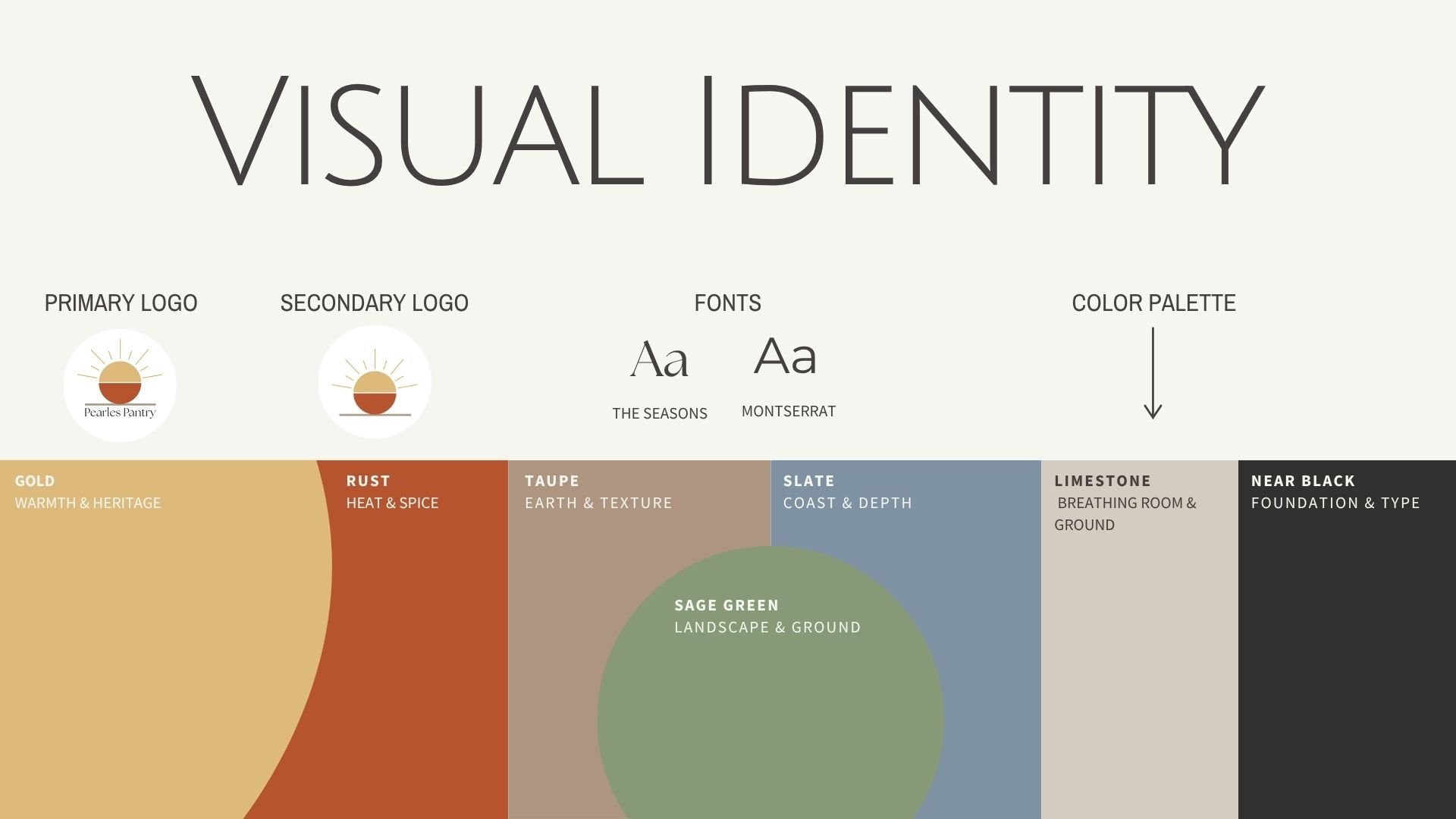
The logo's retro script wordmark already carried a strong visual instinct. Warm, grounded, slightly nostalgic without being sentimental. The colour system built outward from what was already there.
The gold anchors warmth and heritage without reaching for luxury. Rust brings heat and the earthiness of Caribbean spice. Taupe and stone hold the neutral ground, keeping the palette breathable. Slate adds unexpected depth, a coastal note that reads as place rather than product. The muted green ties back to the landscape without competing with the warmth elsewhere in the system.
Together the palette reads as Caribbean in origin rather than generically "tropical," which matters when the brand's whole argument is that it understands the difference.