
Aybel Spaces build beautiful garden rooms. Family-run, based in Oxfordshire, the kind of craftsmanship that genuinely holds up against premium competitors. None of that was showing up on their website.
They were running on a dated WordPress site that simply didn't present the business the way it deserved. Organic traffic had dropped from around 80 users a month in April to 45 by November, a 44% fall in visitors finding them through Google. The pages that were getting found, planning guidance, how-to advice, weren't the pages that sold anything. And across the whole site, they were getting two to five enquiry form submissions a month. For a business with this much to offer, that's not just a traffic problem; that's a website not doing its job.
Here's what we actually did about it, and what happened to their numbers in the three months after it went live.
The site we inherited
Aybel's old site wasn't badly built; it was unclear, and it looked its age. The homepage didn't say who it was for or what made Aybel different from the five other garden room companies operating in the same twenty-mile radius. Trust information, warranties, planning guidance, the family-run story, was buried behind accordions further down the page instead of doing any work near the top. Pricing was vague enough that visitors had no way to self-qualify before enquiring. And the calls to action were mostly text links rather than buttons, which sounds minor until you see how much difference a properly weighted button makes to whether someone actually clicks it.
People were researching Aybel Spaces. The blog and planning content proved that, they just weren't being given a reason to go further down the sales funnel.
Fixing the structure, not just the surface
Before touching any design, we mapped out three buyer types: the home worker who wants a quiet, insulated space and cares about cost and lead time, the family who needs a flexible room and cares about disruption and finish quality and the lifestyle seeker who wants somewhere beautiful to relax, exercise or entertain and responds to imagery over spec sheets. Each of them hits the site with a different question, and the old structure answered none of them clearly.
We also benchmarked five direct competitors, Inside Out Oxford, Kidbys Garden Rooms, Future Rooms, Crown Pavilions and Hawksbeck and looked honestly at what each of them does well. What Aybel could genuinely own, that none of the five were leaning into hard enough, was the combination of family-run trust and proper craftsmanship, without the corporate gloss of the luxury players or the more builder-led feel of the modular ones.
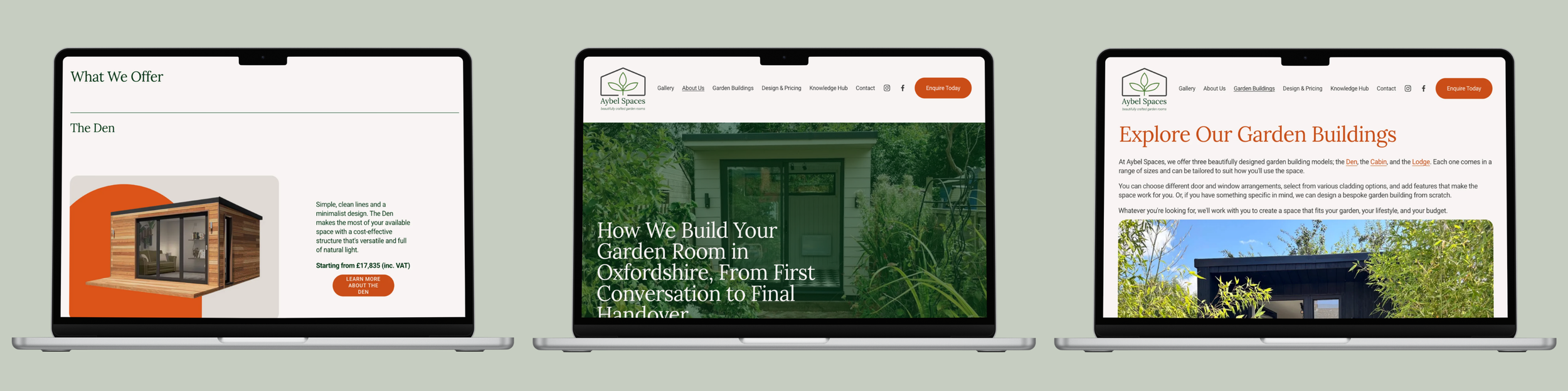
That insight reshaped the sitemap. The old structure had the basics, garden buildings, designs and costs, specifications, a knowledge hub, but nowhere to prove trust once someone was interested enough to look. The new structure added a Warranty and Aftercare page, an Our Process page, and dedicated pages for the three room types, Den, Cabin, Lodge, that had previously been buried in a single designs page. Every user journey was rebuilt around a simple sequence: inspire first with imagery and real use cases, support that with clarity on pricing and planning, prove it with case studies and trust signals, and invite action early and repeatedly rather than saving the one call to action for the bottom of the page.
Improving the content and the SEO underneath it
Structure only works if the content on each page is doing something. Designs and Costs became Designs and Pricing, a small change, but "pricing" reads as more transparent and less like a quote you have to fight for. Planning permission content, previously thin, became a proper resource in its own right, since that's exactly the kind of question a homeowner searches before they're ready to enquire.
Migrating the old blog content across was the part that needed the most care. Some of Aybel's strongest planning and insight articles, the ones already pulling in search visibility, lived on the old WordPress setup and needed recovering and rebuilding rather than simply copying across. Every URL that had already earned rankings needed a matching redirect on the new site too, page by page, before launch, or Aybel would have lost the visibility they already had while trying to build more. There was a lot of work to be done on the written-content side as articles had previously been produced by ChatGPT and posted as-is.
The visual identity changed alongside the content. The old site read as a brochure. Competitors like Crown Pavilions and Hawksbeck were winning on imagery that showed real gardens, real light, people actually using the space, not just product shots of an empty room. So the new site moved to warmer, natural photography set in real Oxfordshire gardens, a defined colour palette, and a proper font pairing instead of whatever the old theme defaulted to.
Three months of real numbers
The site went live at the end of March 2026. Here's what happened across April, May and June, the first three months after launch.
Total users climbed every month: up around 18% from April to May, then a further 33% from May to June. Google organic traffic on its own grew by around 51% between April and June, and direct traffic, people typing the domain in or returning to a bookmark, grew even faster, up 60% over the same period. That combination matters; it's not just more people finding the site for the first time, it's more people coming back to it.
Google Search Console tells the same story from a different angle. In May, the homepage had 6 clicks and 530 impressions. By June, that was 46 clicks and just under 4,000 impressions. The planning permission page went from 7 impressions to 177 in a single month. The garden room insight and regulation content, the pages that were already doing some of the work under the old site, are now being found far more often, which suggests the redirect work protected exactly what it needed to.
Enquiries are moving the same way, with more of the new content pages still gaining ground in search; that's a trend with plenty of room to keep building over the next quarter.
What we'd tell anyone considering a rebuild
If you're in the position Aybel was in, a business that's better than its website suggests, three things are worth knowing before you start.
First, discovery isn't a formality, but it should be. The persona and competitor work is what stops a rebuild from just being a fresh coat of paint on the same unclear structure.
Second, ask whoever you're working with what happens to your existing rankings during the move. If they can't give you a specific answer about redirects and SEO continuity, that's worth pressing on before you commit.
And third, look past the launch date. The real proof of a rebuild isn't the day it goes live, it's what the traffic and enquiry numbers do in the months after.
A website rebuild isn't about making something look newer; it's about removing every reason a visitor had to hesitate. Three months in, Aybel's numbers say it's working!
Frequently asked questions
How long does it take to rebuild a website?
It depends on scope, but a full rebuild covering discovery, sitemap restructuring, content and design typically runs to several weeks rather than months. Aybel's project moved from discovery through to launch inside that kind of timeframe, with the core commercial pages built first and the rest following alongside content and QA.
How much does it cost to rebuild a website?
Cost tends to scale with how much of the site is changing, not just the number of pages. A rebuild that restructures the sitemap, rewrites the content and resets the visual direction, as Aybel's did, costs more than a like-for-like redesign, but it's also the version that actually fixes the underlying problem rather than papering over it.
What's the difference between a website redesign and a website rebuild?
A redesign changes how a site looks. A rebuild changes how it works, the structure, the user journeys, the content strategy underneath the design. Aybel's project was a rebuild for exactly that reason: a fresh coat of paint on the old sitemap wouldn't have fixed why visitors were researching but not enquiring.
How do you keep your Google ranking when rebuilding a website?
Every URL that had already earned rankings on the old site needs a matching redirect on the new one, mapped page by page before launch rather than fixed afterwards. That's what protected Aybel's existing search visibility while the rebuild also worked on growing it.
What are the biggest pitfalls of rebuilding a website from scratch?
The two we see most often are unusual domain and DNS setups that don't follow the standard registrar process, and older content, blog posts and guides that were quietly earning search visibility, getting lost in the move rather than properly migrated. Both are avoidable with the right checks before launch, not after.
I'm looking for a design agency to rebuild our website. Where do we start?
Start with discovery, not design. Understanding who's actually visiting the site, what's stopping them from enquiring, and what competitors are doing better should shape the sitemap and content before a single page gets built.
If you're looking at your own website the way Aybel were looking at theirs, get in touch and we'll talk through what a rebuild would actually involve for your business.
